Wendell Eye Care
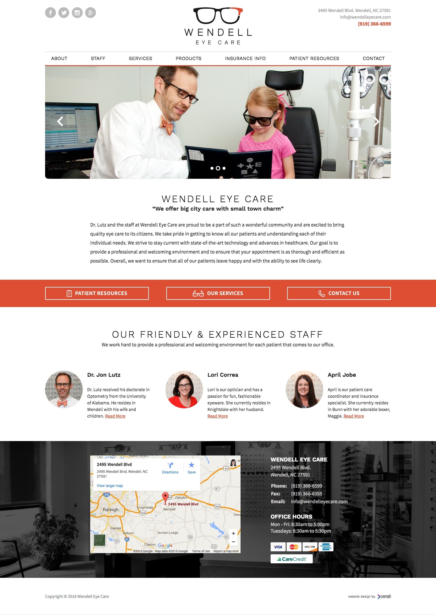
Wendell Eye Care is a small, community-oriented optometry office specializing in personal patient care. They needed a professional website for their new business to highlight their services and experience. Their objective is to showcase who they are. Furthermore, how they can help every patient who walks through their door. We presented them with a custom optometry website design idea perfect for their needs.
We created a modern website with a stylish flair and great pop of color. First, the billboard image gives a feel for the friendly nature of the office. A call to action is vibrant and links to the main highlights of the site. Next, a staff section connects to potential patients for an overall sense of comfort. Lastly, the contact info and map are eye-catching and easily give pertinent information.
“They saw our vision and helped us create it. We love our webpage and are so fortunate to have found them!” Read More
Optometry Website Design Idea Highlights
- fully custom design, no templates
- clean white space with pop of color
- prominent call to action
- friendly staff profiles
- ample services and relating imagery
- visually appealing contact section with map
