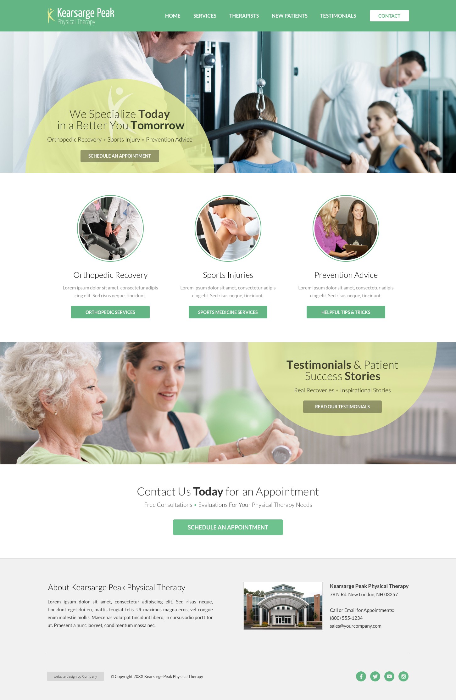
Clean and active website design perfect for many small businesses.
This physical therapy website design example was created using a PT office brand. It can be customized to work with any small business that needs to portray comfort and trust. The clean white space mixes well with the pop of active colors to draw the user’s eye to important information.
The layout focuses on the services section, showcasing what your business can accomplish for a potential customer. Below this is a testimonial section featuring relatable content, a key aspect of building your customer’s trust. The typography promotes action and connects well with the billboard. We then highlight a call to action, a perfect way to evoke a response and bring the customer to you. These features combine to create a successful design for many types of small businesses.
Physical Therapy Website Design Example Highlights:
- Bright, capturing billboard image
- Focus on services
- Intriguing and relatable testimonial section
- Stand out call to action
- Easy to locate contact information
