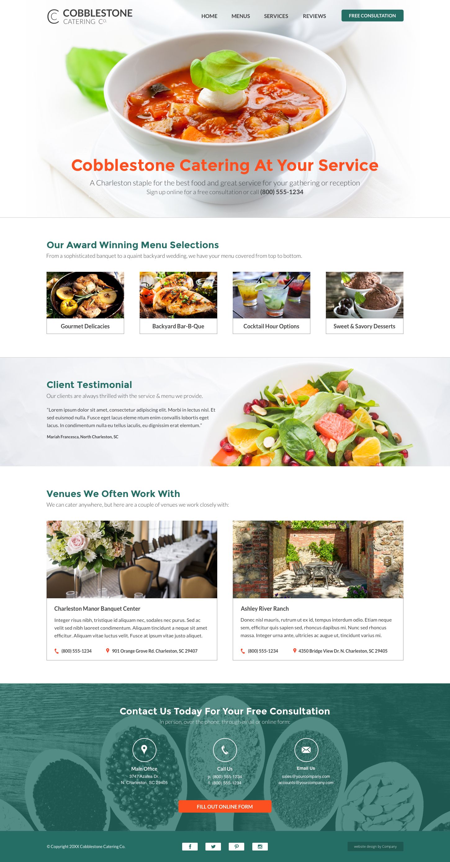
Bright and modern website design suitable for many small businesses.
This catering website design example uses a catering company brand to highlight the layout. Customizable sections work with any small business needing to portray a fresh, professional look with great images. Furthermore, the clean white space mixed with enticing photos gives a strong sense of skillful experience.
The design focuses on strong imagery, with a prominently featured billboard along with brief information. The menu section portrays catering offerings, but can transform into a services section. Equally important, a testimonial area is eye-catching and helps build trust between your business and customers. Underneath, popular venue information is displayed. Also, this section is usable for multiple business locations or services as well. Lastly, the large call to action persuades your potential customer to contact you. These features combine to create a successful design for restaurants and other small businesses alike.
Catering Website Design Example Highlights:
- Stand out menu/services options
- Eye-catching review section
- Venue/locations display with ample information
- Large contact and call to action
